

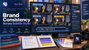
Key Takeaways
- Captions are now watched more than they’re listened past — widely cited research from Verizon Media and Publicis Media found 69% of people watch video with the sound off in public, and 80% are more likely to finish a video that has captions.
- That means subtitles aren’t a background accessibility feature anymore; for a large share of viewers, the caption text is the primary way they experience your video, making it a real, visible brand touchpoint.
- Every platform renders captions differently, from YouTube’s viewer-customizable tracks to TikTok and Instagram’s burned-in text, which makes a written style guide necessary rather than optional.
- Brand consistency and accessibility aren’t in tension. The W3C’s own guidance is clear that caption accuracy and readability come first, with styling built on top of that foundation, not instead of it.
- Consistency starts upstream of styling, in the transcript itself — punctuation, capitalization, and speaker-label conventions need to be standardized before captions are generated, or every platform’s captions will drift differently.
Most brand style guides cover logos, color palettes, and typography down to the pixel, and then say nothing at all about subtitles — even though captions are one of the most frequently seen pieces of branded text a company puts out. That gap shows. A brand might run four different caption styles across YouTube, Instagram, LinkedIn, and a webinar platform without anyone noticing, because subtitles have historically been treated as a utility, not a design asset.
That’s a real gap in 2026, because so much video is now watched without sound. Research from Verizon Media and Publicis Media, still the most frequently cited benchmark on this behavior and covered at the time by Forbes, found that 69% of people watch video with the sound off in public places and 25% do so even in private, while 80% say they’re more likely to watch a video all the way through when captions are available. The study is a few years old now, but its findings remain the standard reference point in the industry, which tells you something on its own: for a huge share of viewers, the caption text isn’t a backup, it’s the primary way they experience your content.
If that’s true, subtitle styling deserves the same consistency as every other visible piece of your brand. Here’s how to actually build and maintain that.
Why Subtitle Consistency Is a Brand Issue, Not Just a Production Detail
- Captions appear on nearly every video a brand publishes, across every platform, far more often than a logo or a tagline shows up in any other format.
- Inconsistent styling — a different font here, a different color there — reads as unpolished even when the actual video content is strong.
- Viewers who watch primarily through captions form their impression of your brand’s voice largely from how that text looks and reads.
- A consistent subtitle style becomes a recognizable visual signature over time, the same way a consistent color palette or logo treatment does.
Captions, Subtitles, Open, and Closed: Getting the Terms Right First
These terms get used loosely, but a style guide needs them precise. According to the W3C’s Web Accessibility Initiative, captions include the spoken dialogue plus relevant non-speech information, like “[phone ringing]” or who’s speaking when it isn’t obvious — built primarily for viewers who are deaf or hard of hearing. Subtitles typically assume the viewer can hear the audio and just need the dialogue translated or displayed, without the non-speech cues.
Closed captions can be turned on or off by the viewer; open captions are burned into the video and always visible. Each combination has different styling constraints — closed captions on YouTube inherit some of the viewer’s own display preferences, while burned-in captions on a TikTok or Instagram Reel are entirely under your control, which is exactly why they need a documented style, not an improvised one video to video.
The Core Elements of a Subtitle Style Guide
| Element | What to Standardize | Why It Matters |
| Font family & weight | One primary typeface, consistent weight | Prevents a different “feel” video to video |
| Color & contrast | Text color, outline/shadow, background box | Readability across light and dark footage |
| Positioning | Consistent placement (usually lower third) | Viewers learn where to look automatically |
| Line length & breaks | Character limit per line, logical phrase breaks | Easier reading, matches accessibility norms |
| Capitalization | Sentence case vs. all caps, picked once | Avoids a jarring style shift between videos |
| Punctuation conventions | Ellipses for trailing off, italics for off-screen speech | Consistent meaning signals for viewers |
| Speaker labels | Format for identifying who’s speaking | Clarity in interviews, panels, multi-host videos |
| Branding elements | Logo or watermark placement relative to captions | Prevents overlap and visual clutter |
None of these choices need to be elaborate. The goal is picking each one deliberately, once, and documenting it — not reinventing the format on every new video or letting it default to whatever a particular editor or tool happens to output.
The Platform-by-Platform Challenge
A single consistent style is harder to maintain than it sounds, because every platform handles captions differently.
| Platform | Caption Behavior | Branding Implication |
| YouTube | Closed captions; viewers can customize font/size | Still publish a styled, burned-in option for clips and shorts |
| Instagram / TikTok | Captions almost always burned in | Full control over styling — the format most worth standardizing first |
| Native captions often default to a plain system style | Burned-in captions needed to preserve brand look | |
| Webinars / e-learning | Closed captions via SRT/VTT, played in various players | Style guide should specify a fallback look for player defaults |
| Broadcast / TV | Often follows strict closed-caption technical standards | Branding takes a back seat to compliance requirements here |
The practical takeaway: you’ll rarely get pixel-identical captions everywhere, and that’s fine. The goal is a consistent core — same font family, same color logic, same tone — adapted sensibly to what each platform actually allows, rather than a different, unrelated style invented for each one.
Why Consistency Starts With the Transcript, Not the Styling
Visual styling gets most of the attention, but a surprising amount of caption drift actually starts upstream, in the transcript itself. If one video’s transcript capitalizes a product name correctly and another doesn’t, if one uses an em dash for an interrupted sentence and another just trails off, if speaker labels are formatted differently from one interview to the next — those inconsistencies carry straight through into the final captions, no matter how carefully the visual style is applied on top.
This is why a documented approach to transcription matters as much as a documented approach to fonts and colors. A transcript that consistently applies your house style for punctuation, capitalization, and speaker labeling gives every downstream caption — on every platform — the same editorial foundation to build from.
Building Your Subtitle Style Guide, Step by Step
- Audit your last 10–15 published videos across platforms and note every place the caption style actually differs — font, color, capitalization, speaker labels.
- Pick one answer for each element in the style guide table above, choosing based on readability and brand fit, not just what a particular tool defaults to.
- Document a short glossary of brand terms, product names, and acronyms so they’re capitalized and spelled the same way in every transcript and caption.
- Create a lightweight template or preset in your captioning tool so new videos start from the approved style rather than a blank default.
- Specify a sensible fallback style for platforms where you don’t control rendering, like native YouTube closed captions or embedded players.
- Review the guide periodically, especially after adding a new publishing platform, rather than treating it as a one-time document.
Common Mistakes in Subtitle Branding
- Prioritizing visual style over readability — a clever font or low-contrast color scheme that looks good in a mockup but is hard to read on a moving background.
- Letting each platform’s default caption settings stand in for an actual brand style, resulting in a different look everywhere by default.
- Treating the style guide as a one-time document instead of updating it as new platforms and formats get added.
- Inconsistent speaker-label formatting between videos, which is confusing for viewers and undermines the professional feel consistency is supposed to create.
- Skipping a documented transcription style, so caption drift creeps back in upstream even after the visual styling has been standardized.
Where TrulyScribe Fits Into This Workflow
TrulyScribe handles the upstream half of this problem: producing accurate, consistently punctuated, speaker-labeled transcripts that give every caption across every platform the same editorial foundation to start from. Its built-in editor lets you standardize brand terms and speaker-label formatting before export, and it exports directly to SRT and VTT — the formats most captioning and video tools use to apply your visual style on top.
Because the same accurate transcript can feed YouTube captions, burned-in social clips, and e-learning subtitles alike, teams get a consistent starting point across every platform instead of regenerating captions separately, and often inconsistently, for each one. This pairs naturally with broader accessibility compliance work and with multilingual subtitle workflows, where the same consistent styling and terminology need to carry through translated versions as well.
Frequently Asked Questions (FAQs)
Should captions match brand fonts exactly, or use a more readable caption-specific font?
Readability should win when the two conflict. Many brand fonts aren’t designed for small, fast-moving text over video, so it’s common and reasonable to pick a close, highly legible alternative for captions rather than forcing the exact brand typeface.
Do accessibility requirements limit how much brand styling I can apply to captions?
Not as much as people assume. Accessibility guidelines focus on accuracy, contrast, and readability rather than prescribing a specific look, which leaves real room for brand styling as long as those readability fundamentals are respected.
Is it worth burning captions into every video, even on platforms with native closed captions?
For platforms like YouTube with reliable closed-caption support, native captions are usually fine for the main upload. For clips and shorts repurposed to platforms like Instagram or TikTok, burned-in captions are generally necessary since native support is less consistent and viewers often watch with sound off by default.
How often should a subtitle style guide be updated?
Review it whenever you add a new publishing platform or notice drift in an audit, rather than on a fixed schedule. A style guide that isn’t revisited tends to quietly fall out of sync with how content actually gets published over time.
Can AI-generated captions be brand-consistent, or do they need heavy manual styling every time?
AI transcription can absolutely be brand-consistent if the underlying transcript follows a documented style for punctuation, capitalization, and speaker labels. The visual styling (font, color, position) is then applied consistently on top through a template or preset, rather than redone manually for each video.
What’s the single highest-impact fix for most brands’ caption inconsistency?
Standardizing speaker-label formatting and capitalization in the transcript itself, before any visual styling is applied. Most visible inconsistency in captions traces back to upstream transcript differences, not the final design choices.
The Bottom Line
With a majority of video now watched at least some of the time without sound, captions have quietly become one of the most frequently seen pieces of text your brand publishes. Treating subtitle style with the same deliberate consistency as a logo or color palette — and building that consistency starting from the transcript, not just the final visual design — is what turns captions from an afterthought into a recognizable part of how your brand actually looks and sounds across every platform.
TrulyScribe gives you the accurate, consistently formatted transcript foundation that every styled caption builds on, so your brand’s subtitle style can stay consistent no matter how many platforms it has to show up on.